Based in Sliema, Malta
MSD
The same fix that saved one user punished another.
A clinical exam request where one late error wiped the entire form. I split it into steps for the users who needed them, and kept a single dense screen for the ones who didn’t. I never touched the backend or rewrote a line. Modeled friction fell 66%.
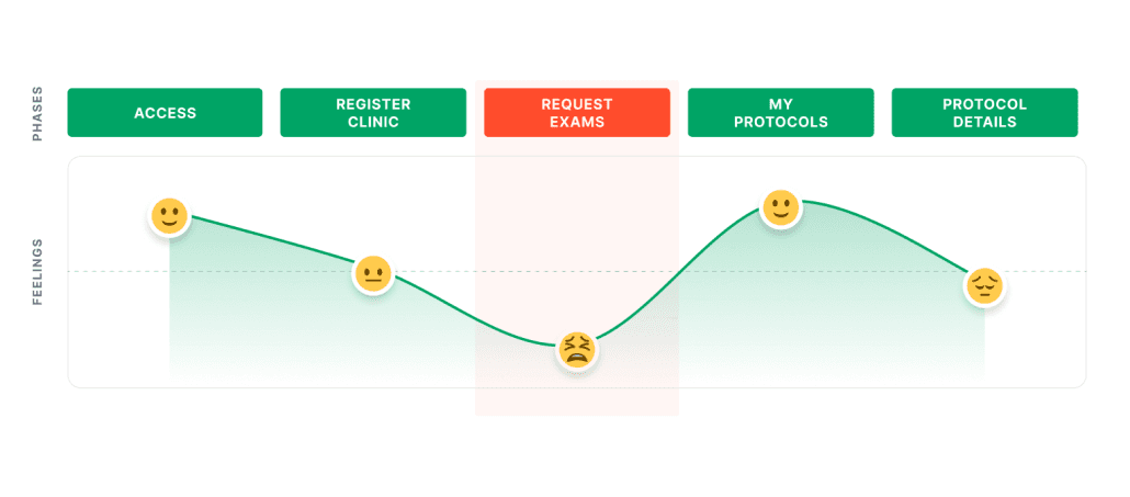
Project Summary
Context
PD Point is MSD's clinical-protocol platform serving 9 profiles across 134 HTML pages, from exam request to material return.
The brief asked to renovate the visual and UX, fast, with no backend changes and no migration to React. The request screen was the worst of it. A wall of ~71 fields, where one error caught at the bottom cost the entire form.
What I did
Reframed the brief and sold the approach
I recast the reskin request into a cognitive-load problem and sold the approach to stakeholders before any pixels. That bought room to slice flows instead of re-dressing them.
Mapped and sliced the critical user journeys
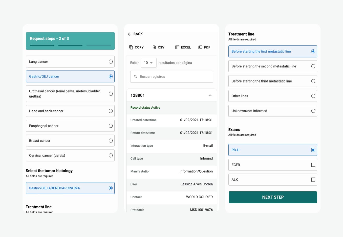
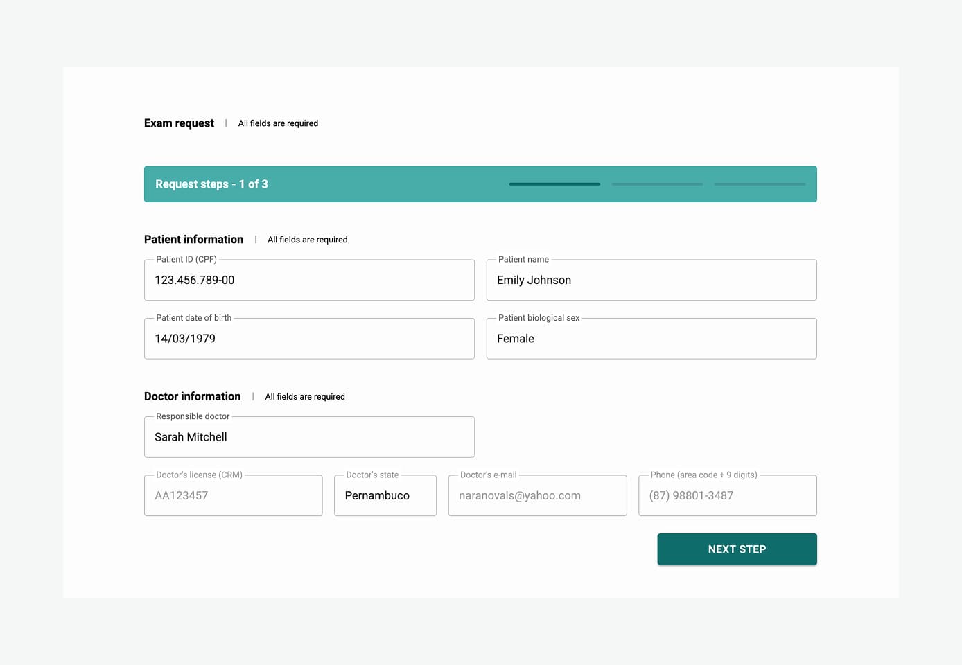
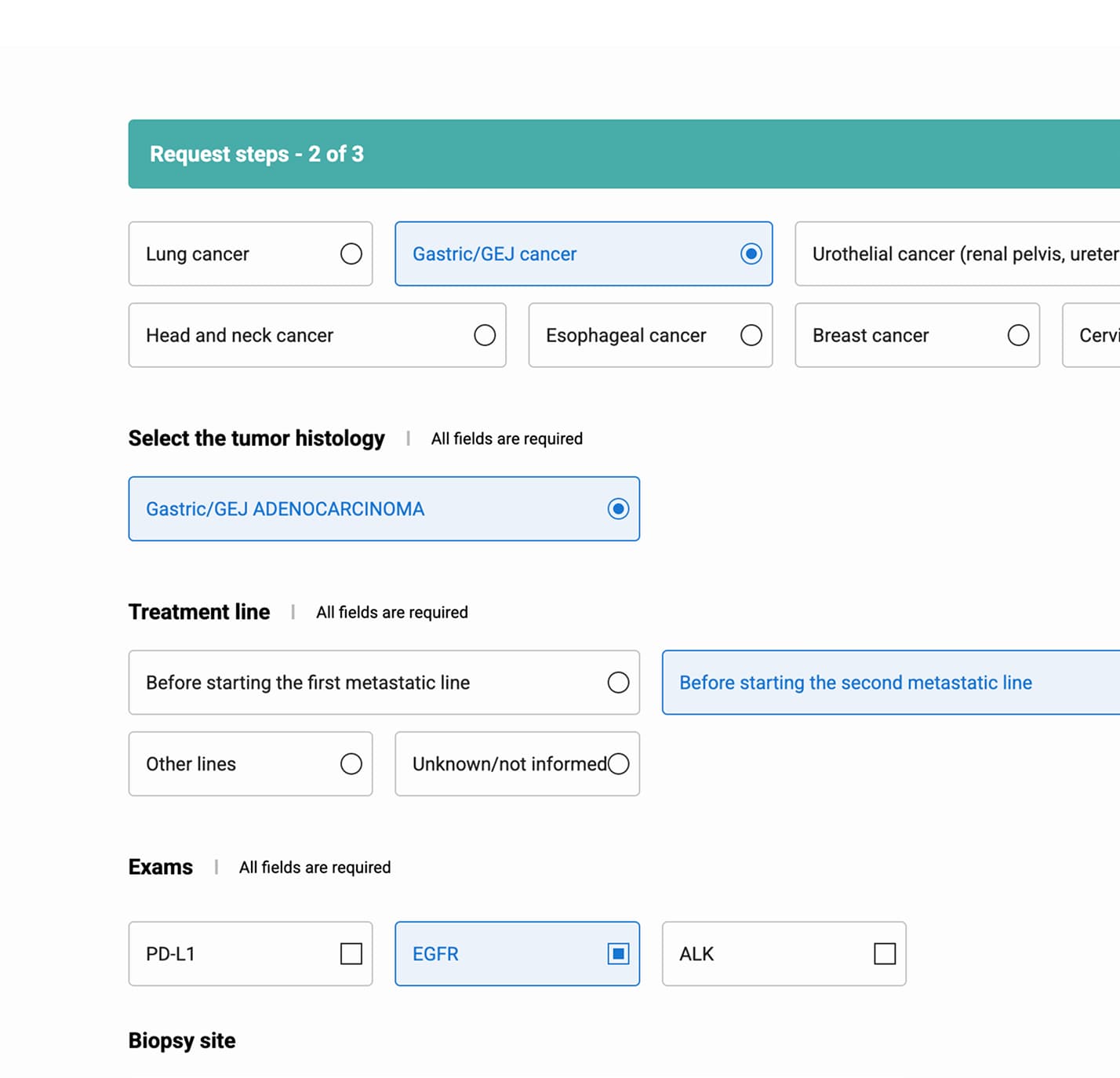
I cut the request form along the three sectors its clinical content already formed, confirmed the load drop with a Hick + Miller friction model, and scoped the stepped flow to infrequent external journeys. Internal power users kept a faster, denser screen.
Chose MUI as the field reference to buy time
Material UI is heavily documented and close to MSD's existing CMS design system. It spared me from drawing fields from scratch and freed my time for the real work, the journeys.
Role
Product Designer
Team
Client
MSD
Technologies
Legacy system (HTML/CSS)
Timeline
6 months
Outcome
Shipped platform-wide · client returned
Responsibilities
Research & Synthesis · UX / Content Strategy · System Design · Legacy Integration (HTML delivery) · Design System Documentation
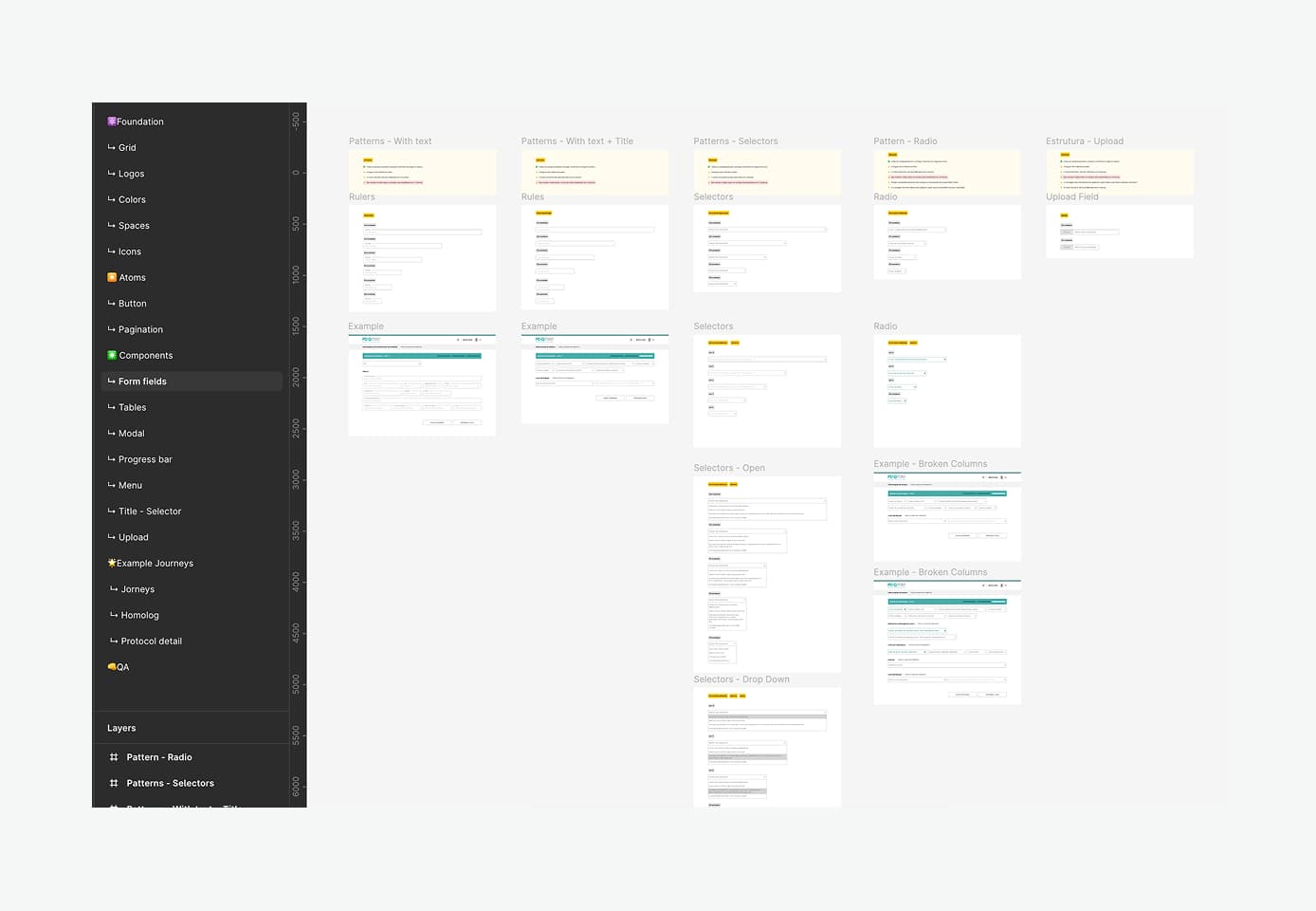
What I delivered
Journey Architecture
Journey architecture + the 3-step request structure
Design System
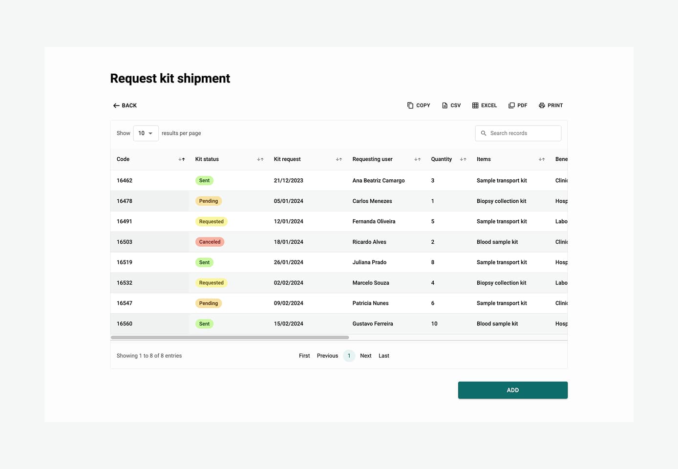
Design system + documentation so improvements wouldn't drift
Mobile Foundation
The product's first mobile experience, built mobile-first
Platform Deployment
Shipped platform-wide: 134 pages in one deployment
RESULTS
Friction cut, risk reduced
The hard proof is commercial: 134 pages shipped in one deployment, zero backend changes, and the client came back for a second project.
−62%
Decision density.
Zero
Backend changes.
−66%
Friction on the request.
ON THE METRICS
Agency context: no direct end-user access and no post-launch analytics.
PROBLEM
A form that
punishes error
PD Point ran 9 profiles across 134 pages. The exam-request screen was the bottleneck, with ~71 fields on one screen.
It did not arrive as a looks problem. It arrived as three concrete failures the business was already feeling.
WHAT TRIGGERED THE JOB
Error wiped everything
One slip near field 68 forced a restart from field 1. No save-as-you-go, no review before submit.
Slow to complete
~71 fields in a single pass made routine exam requests long and draining for the people filing them.
Failed mobile audit
An internal MSD policy audit flagged the platform as not mobile-ready. A compliance gap the redesign had to close.
THE REFRAME · WHAT I DID WITH THE BRIEF
Reskin
Friction reduction
01
What the brief asked
“Renovate visual and UX, fast, no backend migration. The system works. It just looks old.”
02
What I diagnosed
The real problem was cognitive load. Hick’s Law: decision time grows with every option, and users faced 71 in a row. Miller’s Law: working memory holds 7±2 items, not 71.
03
How I sold it
I brought stakeholders to the diagnosis before any pixels. I framed the problem in cognitive science and proposed a fix that needed no backend rewrites.
That bought room to slice flows instead of only re-dressing them. A risky reframe. It landed.
JOURNEYS
Three users,
three steps
The system served 9 profiles, but they clustered into 3 core user archetypes based on how they interacted with the form:
Occasional
Doctor
1 - 5 exams / week
Infrequent use. Needs guardrails, not speed.
Split into steps
Variety
Clinic · Lab tech
5 - 10 exams / day
Constant context switching across many forms.
Steps + consistency
Heavy
Logistics · Call center
25 - 50 repetitions / day
Same form, all day. They know it by heart.
Single tuned screen
The critical insight
WHO ARE WE OPTIMIZING FOR?
Occasional
Split into steps
← fewer fields per screen
Variety
Steps + consistency
Heavy
Single tuned screen
fewer steps per flow →
Novice vs Expert
The same split that frees the occasional doctor slows down the fast operator. “Fewer fields per screen” only helps people who suffer the full screen.
Muscle Memory
Someone who runs the same form hundreds of times a day doesn’t read it anymore. Their hands know it by heart. For them, every extra step is a toll.
THE MISTAKE
One pattern
for everyone
The first rollout made one mistake. It treated every journey the same. The fix was to match depth to fluency.
WHAT WENT WRONG
Steps shipped to every journey
The first version put the stepped flow behind every journey. Internal teams pushed back fast, and they were right. Customer service, clinic registration, and operations run these forms all day and know the fields by heart. Wrapping their pages in steps taxed the people who were already fast.
The split that rescued a once-a-year doctor punished the heaviest users.
THE FIX
Match depth to fluency
I scoped steps to where they earn their keep: the external, infrequent journeys, whose users don’t have the form memorized. Power users kept a single dense screen with progressive disclosure. Fields reveal row by row as earlier answers make them relevant. Lower visible load, no page-to-page tax.
One product, two rhythms.
LEARNINGS
Elegant solutions,
hard boxes
Four things this project taught me about designing something elegant inside constraints you can’t remove.
01
Reframing was 40% of the win
The client asked for a reskin. I diagnosed a cognitive load problem and sold it. That shifted the work from cosmetic to structural, and turned the untouched backend into an asset.
02
Use the cut the content already has
I didn’t impose a number. The material formed three natural sectors, and medical content can’t be sliced mid-section without breaking meaning. Reading existing seams beat inventing my own.
03
Don’t change the pattern on everyone
I rolled steps out across every journey before I saw how different their usage was. Power users felt punished, rightly. The fix was to match depth to fluency.
04
The foundation didn’t become debt
The client came back and built on top. The work held up. It didn’t rot or require rewrites. It scaled.